Refik Anadol has made his name by producing super scale animations that rely on machine learning algorithms, a large cast of studio assistants, and meanings which are borrowed from the raw material consumed by the algorithms. His invited exhibition at the Serpentine in London, entitled Echoes of the Earth: Living Archive, takes over the whole of the Serpentine North Gallery, is totally eye-catching. The TL;DR is: go. Quickly. It closes April 7 2024.
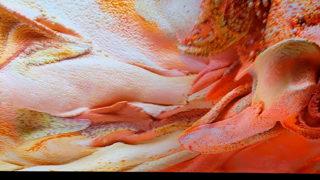
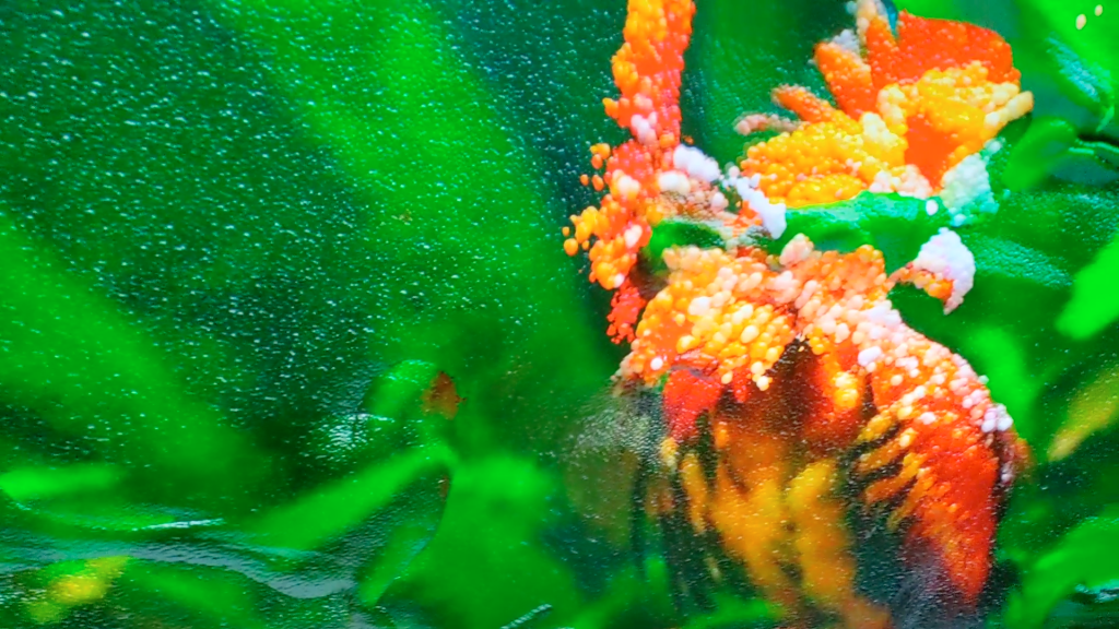
The images in the exhibit range from literal-seeming to highly abstract, and the animations which sequence them flow from one mode to the other. Everything is synthetic – the images are derived from applying machine learning algorithms to very large datasets of other, real images. On which more later. The results sometimes seem literal – as with this synthetic coral:
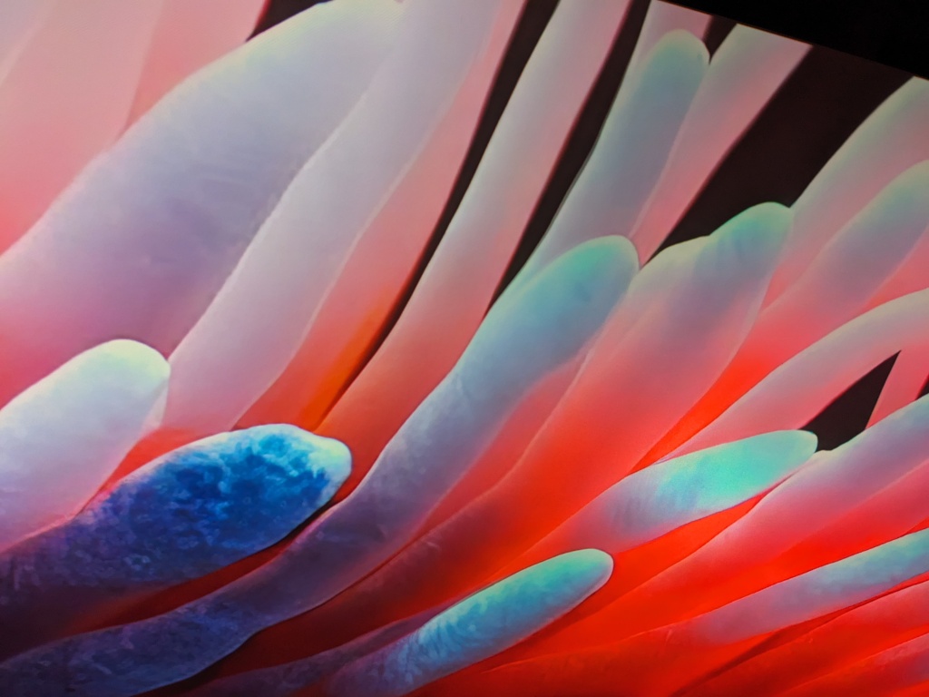
Refik Anadol Echoes of the Earth: Living Archive
Serpentine Gallery London 2024
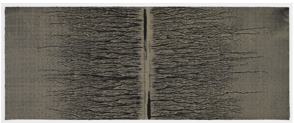
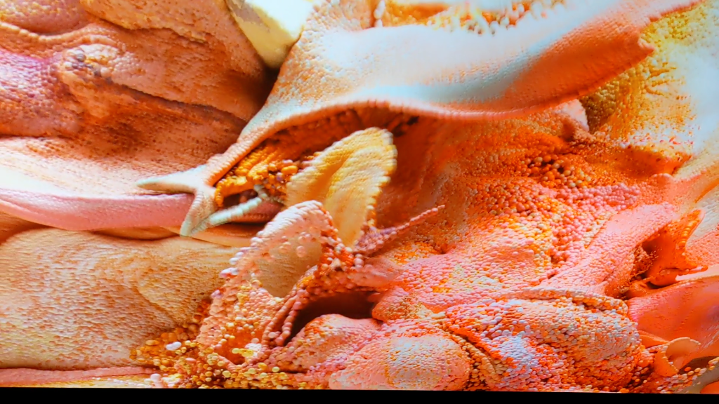
Sometimes the images produced by the operation of the models are highly abstract, as in this candy coloured image, which seems fluid-like and tissue-like, but does not obviously represent any particular thing:
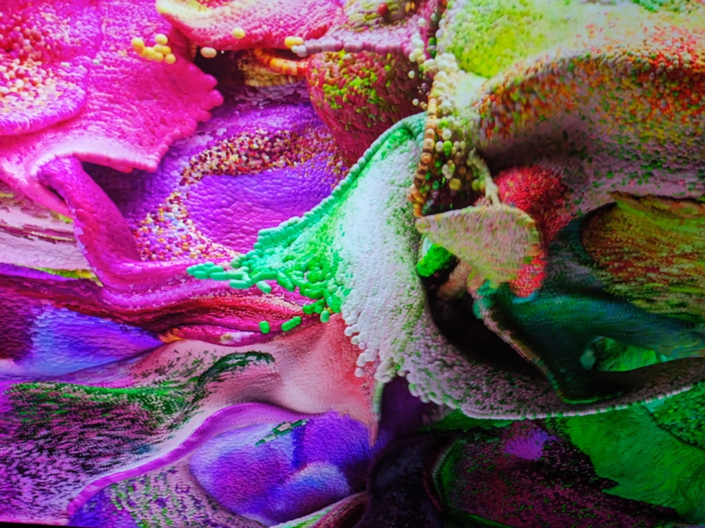
Refik Anadol Echoes of the Earth: Living Archive
Serpentine Gallery London 2024
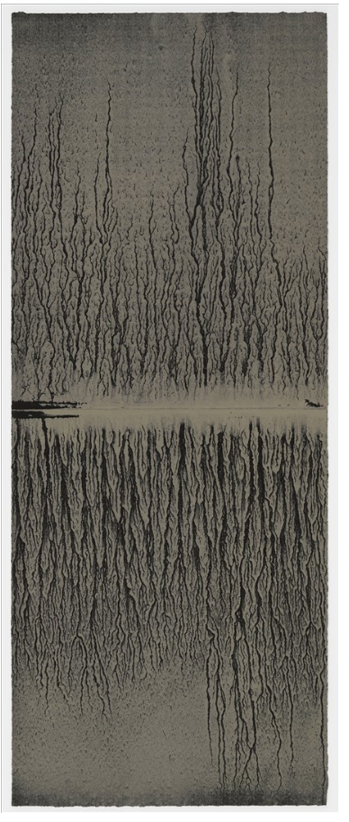
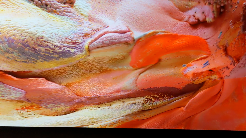
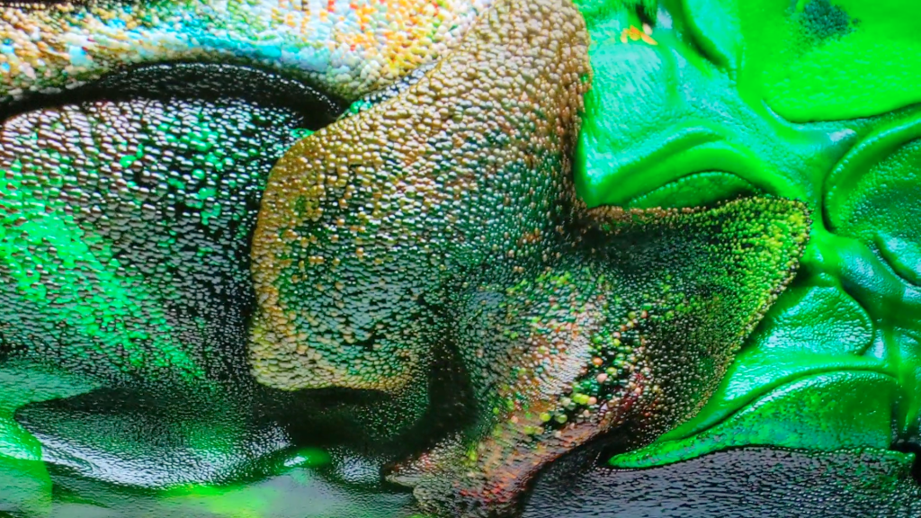
The animations often looks like they are driven by a fluid dynamics simulation. They proceed at a comfortable pace. The colour palettes are harmonious, the surface lighting is gentle. Because of the palette and palette transitions chosen, the sequences have a tendency to look “nice”.
The visuals aren’t always explicitly representational, although the models which generate them use real image captures as inputs. But even when they aren’t interpretable as specific things, the outputs all have a biomorphic flavour to them, reflecting the characteristics of their inputs. Some sequences evoke associations of clouds of organic tissues in perpetual motion and transition. As indeed real weather and real tissues are.
Refik Anadol Echoes of the Earth: Living Archive
Serpentine Gallery London 2024
Sometimes, the images flow from the purely abstract towards representational, then back off again. This gives the feeling of life-forms being created – and dissolving. The pace is slow enough that it doesn’t feel frenetic, rather graceful.
Refik Anadol Echoes of the Earth: Living Archive
Serpentine Gallery London 2024
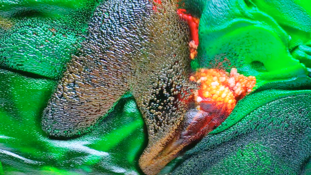
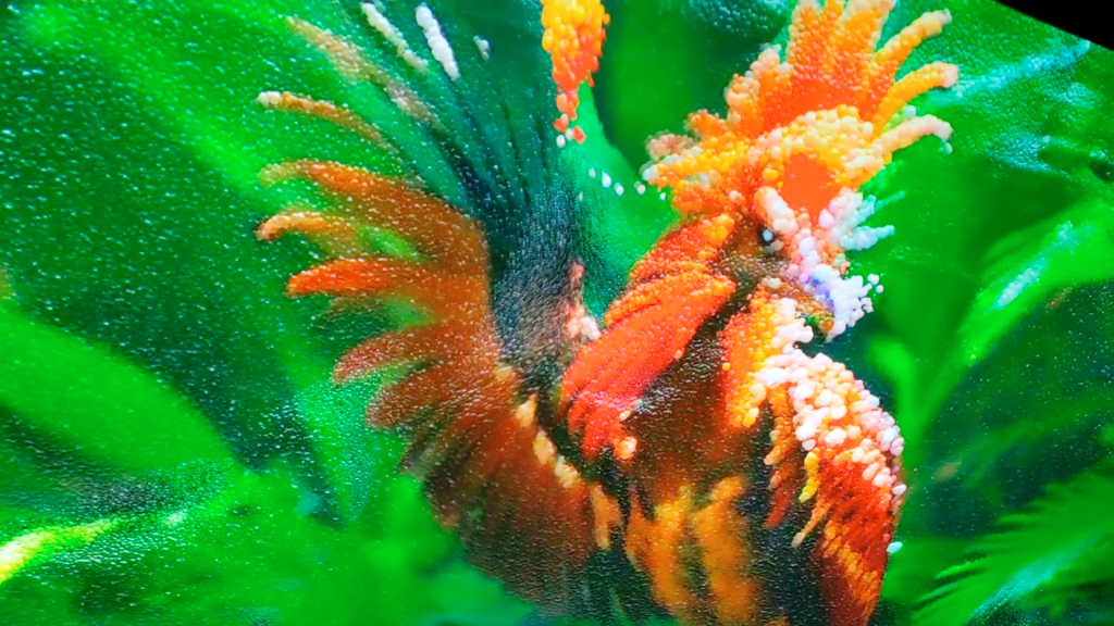
As is the way with the state of the art around synthetic ML-based images of beings, there are times when the synthesis creates “errors”, as seen in this bird with two beaks, and a foot whose claw doesn’t grip the surface:
Refik Anadol Echoes of the Earth: Living Archive
Serpentine Gallery London 2024
What are we to make of this? The images being synthesised and streamed together explore the latent space of the models – creating images of possible beings. The models are based on very very large datasets of actual images, but the model outputs are novel. Sometimes they create things which we instinctively understand would be unable to exist in reality.
In a way, these model “errors” serve to highlight the preciousness of actual life and beings. Not all corners of this very effortfully produced and highly dimensioned latent space are actually habitable. Visual representation is fundamentally a surface phenomenon, with only imperfect connections to mechanism.
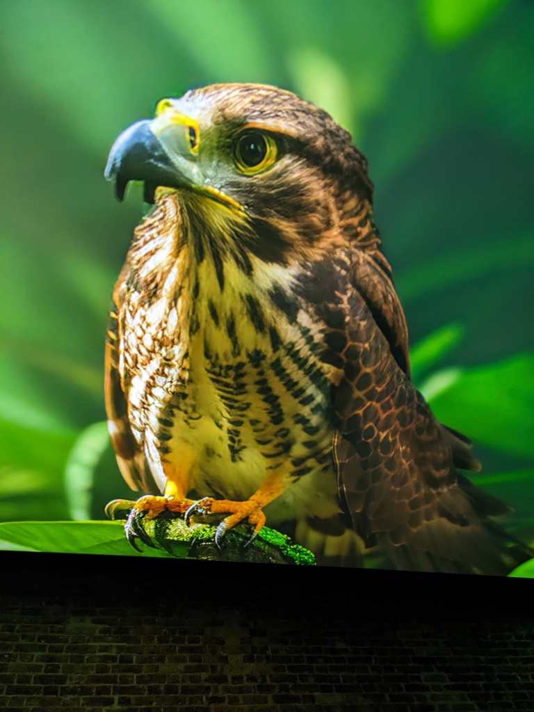
Sometimes what is created is beautiful, as in this sequence of a lotus turning into a lotus:


Refik Anadol Echoes of the Earth: Living Archive
Serpentine Gallery London 2024
There is treasure to be found in mining latent spaces, and Anadol and his team have certainly found some. Dreams, even deep ones, do sometimes turn to nightmares though. The potential for monstrosity, as well as beauty and impossibility, is equally latent in the technique.
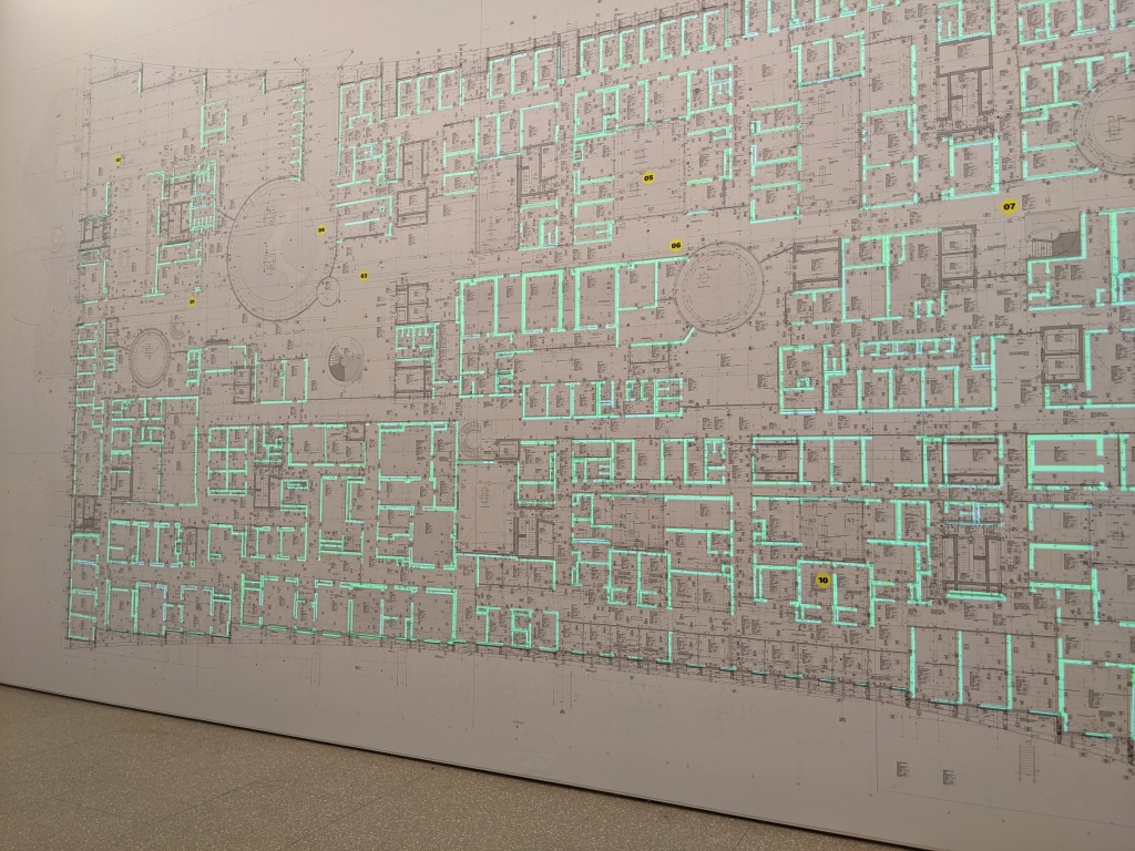
The story of how the base data images are sourced, and how the resultant images are synthesised is very much a part of the work. Which is very much on trend. This display, which is part of the exhibit, dramatises the multitudes of base data images that went into creating the models:
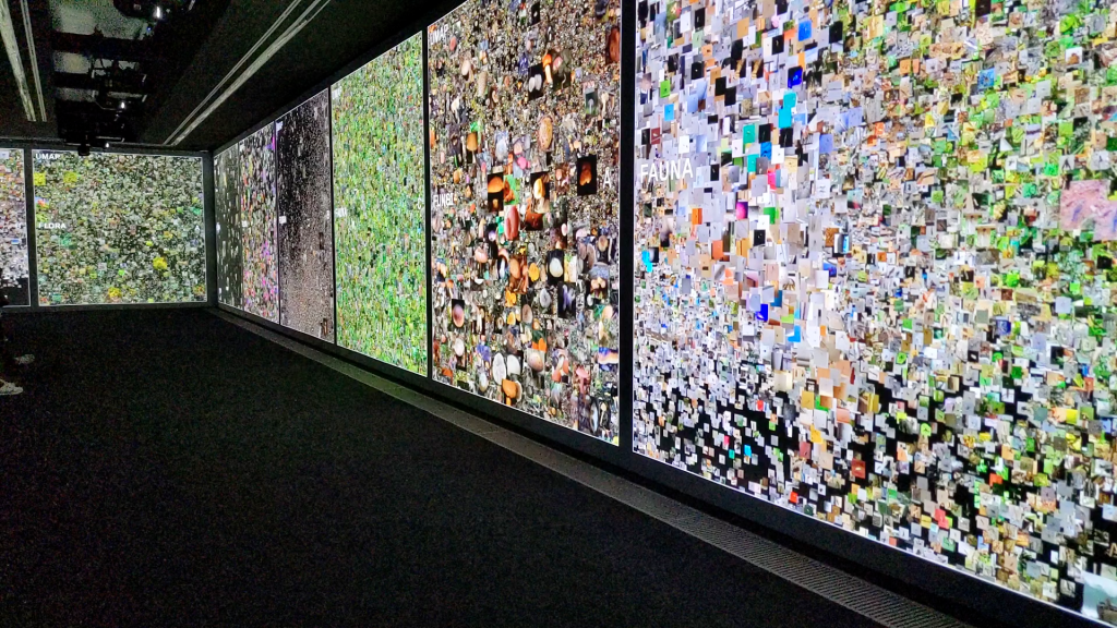
Refik Anadol Echoes of the Earth: Living Archive
Serpentine Gallery London 2024
The works are made possible by the collaboration of an impressive number and range of institutional collaborators, such as the Natural History Museum, and the Smithsonian, who have collectively contributed millions of images from their own collections to be used as training data. Many of the works use what Anadol calls their Large Nature Model, a play on Large Language Models (LLMs) of ChatGTP fame. (This model is, apparently, open sourced – although, interestingly, I am not the only one who can’t find it on GitHub.) All the works seem to use NVidia StyleGan2 as the underlying model framework.
This is the first of Studio Anadol’s installations that I’ve seen in person. In concept and style it has strong links to his blockbuster 2022-23 installation, Unsupervised, at MOMA in NYC. Unsupervised was a never-ending generative machine learning-based animation using, as its raw material, 200 existing works in MOMA’s collection. This use of freely contributed material and generative ML-driven animations are common threads tying the the two exhibits together.
The MOMA installation was accompanied by righteous chat about it being “on the blockchain” – but times change. The Serpentine exhibition also surfs the zeitgeist, but doesn’t mention crypto. Now the force being harnessed is the sharp wind of eco-anxiety. This is somewhat ironic, given the compute power – and energy – which must have been involved in creating the exhibition’s works. Anadols’ explanation of the intent and process behind the highly collective work – of which the Serpentine exhibition is just the first public manifestation – was launched at Davos last year: you can check out the promo here.
So? It’s an eyeful, in a good way, and it represents boss levels of effort and collaboration. But the outputs – although they are “nice” – make me melancholy. In exploring the latent corners of a many thousand dimensioned model space built from a multitude of images of living things – what have we learned? That actual, working life is precious in its uniqueness? It’s a bold exploration, and it’s certainly uncovered some beauty, but I don’t feel the exploration has helped us, collectively, arrive anywhere. Yet.